Bar None

An end-to-end rebuild for Australia’s freshest snacks

Created in founder Brea’s kitchen and scaled to thousands of homes, Bar None is a fresh take on snack bars. Fridge-fresh bars weren’t a thing, until now.

We met Brea early in her journey. She had been churning away on recipe and scaling manufacturing for some time, and had just launched into some local Sydney grocers. But after pouring so much love into the product, she didn’t feel the same affinity for her branding. And nor did customers.

We partnered with Bar None to build out a new brand identity, packaging designs and brand world. Our goal was to do the product and founder justice - a cool, fresh look for an epic innovation.

SERVICES
Brand strategy
Brand identity refresh
Packaging design and artwork
Shelf impact testing
Photoshoot and brand world

Cold pressed context

Bar None is different because it’s made entirely of fresh food - which is exactly why it needs to be refrigerated.

The original design lacked appetite appeal, a strong brand presence and a clear reason to buy.

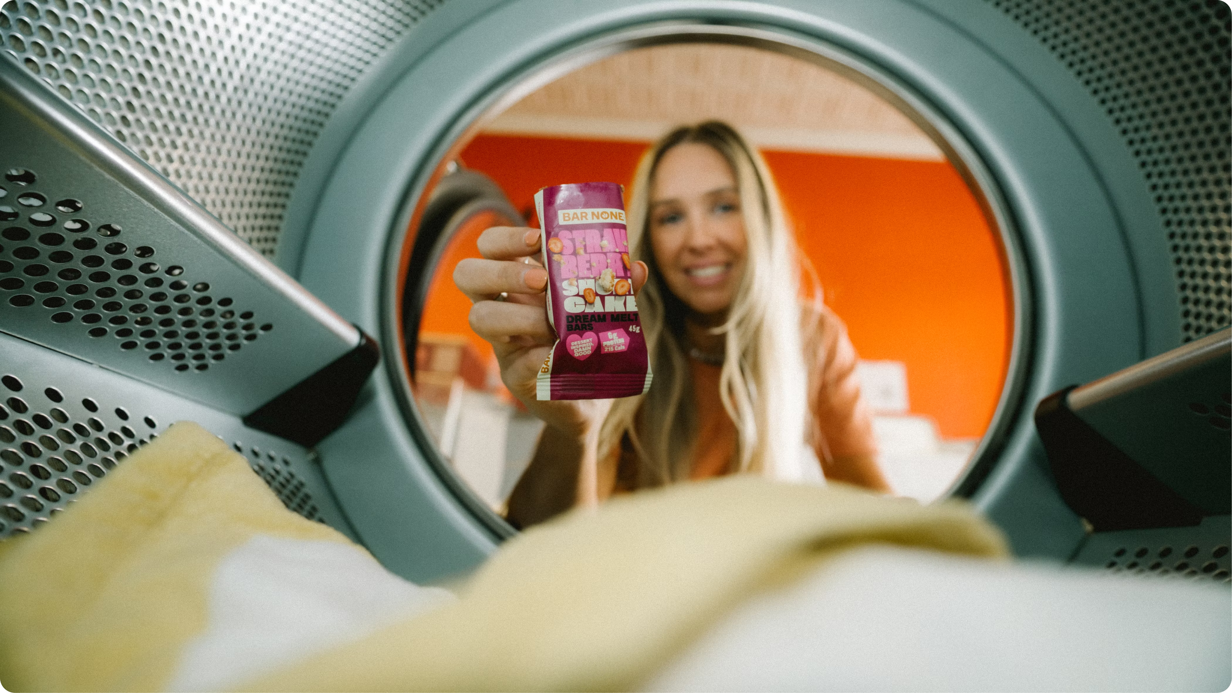
The new Bar None visual identity focuses on flavour, a fresh and cohesive colour palette and most importantly - context. We came up with the range name ‘cold pressed bars’ to help the shopper contextualise why they are in the fridge, along with the clear consumption occasion called out on the shipper carton.

The end result has led to more bars in baskets and more cartons in fridges, helping Bar None lift rate of sale and expand distribution.

A word from Brea, founder of Bar None

“Working with Brent and the Mind Control team was hands down the best decision I made for Bar None. They didn't just make us look good, they backed every decision with real data: competitor mapping, audience work, eye-tracking. Every round of revisions made the brand sharper, never just prettier. We came out the other side with a brand that belongs on shelf next to names 10 times our size. Thoughtful, rigorous, and legends to work with from day one.”